A laundry room deserves as much attention as any other space—especially when the right paint color can infuse it with calm, energy, or sophistication.
From bold jewel tones to soft pastels and warm neutrals, the right hue can elevate your utility space into something you enjoy being in. Here are 35 paint color ideas crafted to inspire and guide your choice.
Contents
- Crisp and Classic Whites
- Subtle Greys and Greiges
- Calming Blues and Aqua Hues
- Soothing Greens and Sage
- Warm Yellows and Cheerful Tones
- Cheerful Corals and Pinks
- Bold Blues and Navy Choices
- Rich Greens and Unexpected Depth
- Warm Earth Tones and Mood Enhancers
- Jewel and Moody Tones
- Unexpected Pastels and Fun Hues
- Styling and Layout Advice
- Buying Guide: Choosing Your Ideal Laundry Room Paint Color
- Frequently Asked Questions
- How many coats of paint should I use in a laundry room?
- What paint finish is best for laundry rooms?
- Can I paint cabinetry and walls different colors?
- Will bold colors make a small laundry room feel smaller?
- How do I avoid my paint looking too dark or flat?
- Should I include washable paint?
- Do I need primer if going over existing paint?
- Final Thoughts
Crisp and Classic Whites
1. Clean White
A bright, pure white that instantly brightens and opens up tight laundry spaces. Reflects light beautifully and feels refreshing.
2. Soft Warm White
White with subtle warmth—less stark than cool white. Ideal for rooms with minimal natural light, offering a cleaned‑up feel without being clinical.
3. Creamy White
Soft, gentle white with a hint of creaminess. Works well alongside warm fixtures or wood shelving for a cozy, welcoming vibe.
Subtle Greys and Greiges
4. Light Soft Gray
A pale gray that offers neutrality while avoiding shadowy or cold tones. Ideal for pairing with steel appliances or white trim.
5. Warm Greige
A blend of gray and beige, greige offers warmth with sophistication. Complements linen baskets and stone countertops beautifully.
6. Medium Ash Gray
A mid-tone gray shade with a subtle blue or green undertone. Offers depth without overpowering, ideal for coordinating with cabinetry.
7. Deep Charcoal
A dark, rich gray that lends dramatic elegance. Best reserved for cabinets or single accent walls to avoid shrinking small rooms.
Calming Blues and Aqua Hues
8. Sky Blue
A pale, airy blue that gives a sense of spaciousness. Great in rooms lacking natural light, and pairs well with white trims and shelving.
9. Soft Aqua Blue
Cool and inviting, this tranquil shade energizes laundry routines with a calming, spa‑like vibe. Works beautifully with white and light wood elements.
10. Sea‑Mist Blue
A muted greenish‑blue that’s serene and sophisticated. Offers a coastal-living aesthetic when paired with nautical touches or white cabinetry.
Soothing Greens and Sage
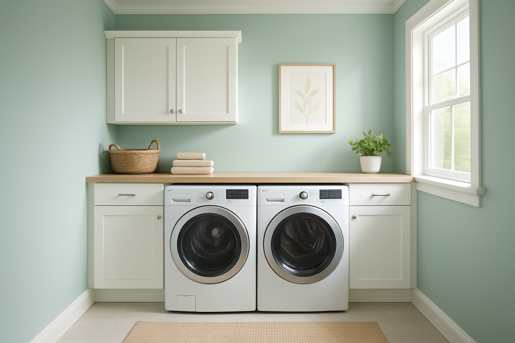
11. Pale Sage Green
Earthy and understated, sage brings a natural, restful feel to functional spaces. Ideal for pairing with wicker baskets and wood accents.
12. Garden Sage
A medium sage with green-gray undertones. Calming yet interesting, creating a subtle background without appearing bland.
13. Olive Gray
A moody but approachable green-gray tone that adds depth and serenity. Works well with brass or matte black hardware.
Warm Yellows and Cheerful Tones
14. Buttercream Yellow
A soft, creamy yellow that radiates warmth without overpowering the senses. Adds gentle contrast with white washers or shelves.
15. Pale Lemon
Refreshing and bright—perfect for energizing small laundry spaces. Works well with natural light or paired with green plants.
16. Golden Yellow Accents
Vibrant and sunny, this tone livens up the room without feeling overwhelming. Ideal for an accent wall or trim detail.
Cheerful Corals and Pinks
17. Dusty Rose
A muted, elegant pink with warm undertones. Adds personality while maintaining calm balance.
18. Warm Blush Pink
Soft and inviting, blush can brighten small rooms and pair nicely with brass fixtures or warmth in flooring.
19. Subtle Coral
A soft coral tone that energizes the space with sophistication. Great as an accent behind cabinets or shelving.
Deep and dramatic, navy commands attention but remains elegant. Best used on cabinets or accent walls to avoid overpowering small spaces.
21. Slate Blue
A gray-blue deep enough for accent scenarios, offering depth without feeling moody or small.
22. Deep Teal Blue
Rich blue-green tone, enhanced by metallic or white trim. Adds personality and depth while complementing wood finishes.
Rich Greens and Unexpected Depth
23. Forest Green
Moody and lush, this green can create a cozy and intimate laundry room. Works best on select walls or cabinets with white contrast.
24. Emerald Green
Bold and luxurious—perfect for highlighting a feature area. Keeps the room feeling unique without feeling cluttered.
25. Muted Olive Green
Subtle and grounded. Adds character while remaining soft and approachable in lighter-lit rooms.
Warm Earth Tones and Mood Enhancers
26. Terracotta Brown
Earthy and warm with rustic appeal. Pairs beautifully with stone accents, baskets, and woven textures for a homey effect.
27. Mocha Taupe
A rich brown-gray color that feels cozy without overwhelming. Ideal when paired with metal fixtures or wooden shelving.
28. Warm Taupe
Soft neutral with warmth and sophistication. Coordinates beautifully with greige tones for a calm, layered palette.
Jewel and Moody Tones
29. Deep Plum
Rich and dramatic, plum adds elegance and character to small spaces. Pair sparingly—perhaps on one wall or trim area.
30. Burgundy Red
Warm and sophisticated, can work as a small accent to create visual interest and energy.
31. Dusty Mauve
A muted purple with warmth and personality. Offers a soft alternative to pink or coral while staying elegant.
Unexpected Pastels and Fun Hues
32. Periwinkle Lavender
A soft cross between blue and violet—a whimsical choice that still feels refined and peaceful.
33. Mint Green
Refreshing and bright, mint creates an energizing but clean look. Ideal for small rooms with neutral accents.
34. Biscuit Beige
A gentle neutral with warmth—works beautifully as backdrop to bolder accents or with light-gray trim.
35. Espresso Brown Accent
Not a wall color, but painting cabinetry or trim in rich espresso can ground a lightly-colored laundry room for polished contrast.
Styling and Layout Advice
Choose Finish Wisely
Opt for satin or semi-gloss finishes on walls or trim—they resist moisture better, are easier to wipe clean, and add subtle reflectivity in small spaces.
Test Color Samples
Small rooms can appear much darker. Test swatches of selected color on walls and observe under both natural and artificial light before committing.
Use Accent Walls
If bold color feels intimidating, paint one wall—perhaps behind appliances—or cabinetry rather than the full room for impact without overwhelm.
Pair with Complementary Shelving and Trim
A crisp white trim or shelf pair well with deep or bold paint colors, while warm neutrals blend elegantly into surrounding architecture.
Add Texture Through Accessories
Complement paint hues with baskets, rattan bins, wooden shelves, woven rugs, or botanical accents to soften utility surfaces visually.
Layer Lighting
Warm-toned LED or pendant lighting can balance cool hues and enhance coziness. Under-cabinet lighting helps brighten task areas.
Buying Guide: Choosing Your Ideal Laundry Room Paint Color
Consider Natural Light Levels
Rooms with little natural light benefit from warm whites, soft greens, or pale blues. Darker or moody tones work best in well-lit or larger rooms.
Match Undertones to Fixtures and Floors
Observe whether your hardware, cabinetry or floors lean warm or cool and choose colors that harmonize. For example, sage pairs with olive wood, while crisp white suits stainless metal.
Factor in Mood and Function
- Calming colors: soft green, aqua, pale gray
- Energizing: lemon yellow, coral, teal
- Sophisticated: navy, charcoal, forest green
Choose Durable Finishes
Semi-gloss or satin finishes hold up to humidity and cleaning better than flat finishes.
Don’t Be Afraid to Mix Shades
Use lighter hues on ceiling and upper walls, bold or moody accent colors lower down or behind appliances for layering.
Sample and Evaluate at Different Times of Day
Color shifts depending on light—morning sun, afternoon glare, or cool evening bulbs may change their perception.
Complement with Textiles
Soft towels, rugs, and baskets in coordinated tones will enhance and tone down punchy paint palettes for cohesive styling.
Frequently Asked Questions
How many coats of paint should I use in a laundry room?
Two coats are recommended for full coverage and durability. Primer may help on stark or dark color transitions.
What paint finish is best for laundry rooms?
Satin or semi‑gloss finish is preferred for moisture resistance, easy cleaning, and better light reflection.
Can I paint cabinetry and walls different colors?
Yes. Contrasting cabinets (e.g. deep navy) against light walls or vice versa can create visual interest and break up the space.
Will bold colors make a small laundry room feel smaller?
Not necessarily if balanced well. Light reflectivity, trim contrasts, and natural light can keep bold colors from shrinking the space.
How do I avoid my paint looking too dark or flat?
Use top-quality paint, apply even coats, avoid mixing brands, and test small areas before full painting.
Should I include washable paint?
Yes—paints labeled washable or scrub-resistant will stand up better to detergent splashes, scuffs, and moisture.
Do I need primer if going over existing paint?
Primer helps especially when changing light to dark shades or painting over glossy or stained surfaces.
Final Thoughts
With thoughtful color selection, your laundry room can become both functional and beautifully inviting. Whether you choose calming sage, energizing lemon, dramatic navy, or soft blush, there’s a paint color here to elevate laundry day.
This guide offered:
- 35 distinctive paint color options suited for various moods and styles
- Styling advice tailored to small or well-lit laundry spaces
- A detailed buying guide on finish, undertone, and durability
- FAQs to assist with practical decisions
Now you’re equipped to create a laundry space that feels thoughtfully designed—whether it’s light and airy or bold and stylish. Pick your colors, test samples, and enjoy creating a utility room that feels less like a chore and more like a haven.