
Built-in bookshelves can do much more than store books. Their color can change the entire mood of a room, highlight architectural details, and make a living room, home office, or bedroom feel more polished. The right shade depends on your wall color, flooring, natural light, furniture, and the atmosphere you want to create.
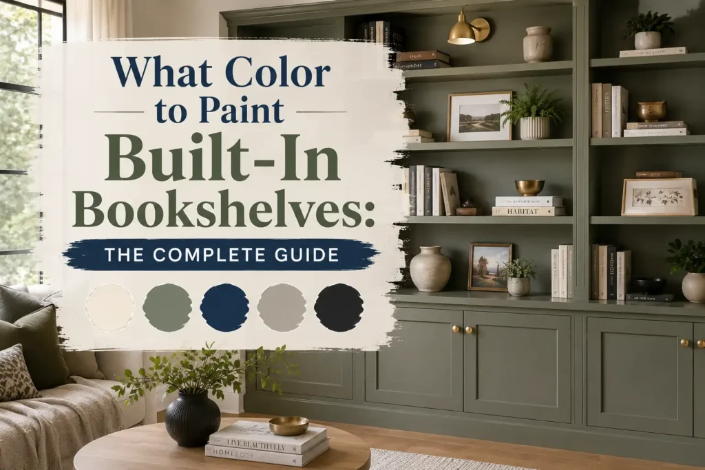
Whether you prefer a bright, timeless look or a bold statement, there are plenty of beautiful options to consider. This guide explores the best colors for built-in bookshelves, explains how to choose the right shade, and shares practical painting tips for a professional-looking finish.
Items to Buy
Before choosing your bookshelf color, gather the basic supplies needed to prepare and paint the built-ins properly.
- Interior cabinet and trim paint: Shop interior cabinet paint on Amazon
- Paint primer: Shop interior paint primer on Amazon
- Angled paintbrushes: Shop angled paintbrushes on Amazon
- Small paint roller kit: Shop paint roller kits on Amazon
- Painter’s tape: Shop painter’s tape on Amazon
- Sanding sponges: Shop sanding sponges on Amazon
- Wood filler: Shop paintable wood filler on Amazon
- Drop cloths: Shop reusable painting drop cloths on Amazon
Affiliate disclosure: As an Amazon Associate I earn from qualifying purchases.
How to Choose the Best Color for Built-In Bookshelves
The most successful bookshelf colors complement the room rather than compete with everything around them. Before selecting a paint chip, consider the following factors.
Look at Your Wall Color
Your bookshelf color can blend into the walls or create a deliberate contrast. Matching the shelves to the wall color makes the entire installation feel integrated and can help a small room look less visually busy. A contrasting shade creates a focal point and draws attention to the built-ins.
For example, white bookshelves against warm white walls create a soft, cohesive effect. Navy shelves against pale gray walls provide a more dramatic appearance. If the room already has colorful furniture, artwork, or patterned wallpaper, a quieter bookshelf color may help balance the space.
Consider Natural and Artificial Light
Light affects how paint colors appear throughout the day. Dark colors can look rich and sophisticated in a bright room but may feel heavier in a room with limited natural light. Pale colors reflect more light and can make shelves feel airy.
Check paint samples in the morning, afternoon, and evening. Also examine them under the lamps you normally use. A color that appears neutral in daylight may look yellow, pink, green, or gray under different bulbs.
Coordinate With Flooring and Furniture
Look at the undertones in your flooring, sofa, curtains, and wooden furniture. Warm oak and honey-colored wood often pair beautifully with creamy whites, earthy greens, and warm greige. Cooler gray flooring may work well with crisp white, slate blue, or charcoal.
You do not have to match every finish exactly. Instead, aim for a combination that feels intentional and balanced.
Decide Whether the Shelves Should Stand Out
Ask yourself whether the built-ins should be the main feature of the room or a quiet backdrop for books and accessories.
- Choose a wall-matching shade for a seamless, understated effect.
- Choose a contrasting color to emphasize the shape and details of the shelves.
- Choose a deeper color on the back panels if you want to highlight displayed objects without painting the entire installation dark.
- Choose a muted color if you want personality without overwhelming the room.
15 Best Colors to Paint Built-In Bookshelves
1. Classic White
White is a dependable choice for built-in bookshelves because it feels clean, bright, and versatile. It works in traditional homes, contemporary spaces, farmhouse interiors, and coastal rooms. White shelves also provide a neutral background for colorful book spines, framed photographs, ceramics, and decorative objects.
The important decision is which white to use. Crisp whites create a fresh, modern look, while softer whites with warm undertones feel more relaxed. If your walls are already white, matching the undertones can help the bookshelves blend into the architecture instead of looking like a separate addition.
Best pairing: Warm white walls, natural wood flooring, and neutral furniture.
2. Warm Off-White
Warm off-white provides the brightness of white without looking stark. It is particularly attractive in rooms with beige upholstery, cream curtains, natural wood, or traditional architectural details.
This shade can soften a large wall of shelving and create a welcoming atmosphere. It is also useful when pure white looks too cool against the other finishes in the room. Look for subtle cream or ivory undertones, but test the sample carefully to make sure it does not appear too yellow under your lighting.
Best pairing: Beige walls, oak floors, linen upholstery, and brass accents.
3. Greige
Greige combines the qualities of gray and beige, making it a flexible neutral for built-ins. It provides more depth than white while remaining understated enough for everyday living spaces. Depending on its undertones, greige can look warm and earthy or slightly cooler and more contemporary.
This color works particularly well when the room includes a mixture of warm wood and gray fabrics. It can also help large built-ins feel integrated without disappearing completely against the wall.
Best pairing: Taupe sofas, medium-tone wood, cream accessories, and soft gray walls.
4. Sage Green
Sage green brings a gentle, nature-inspired quality to built-in bookshelves. Its muted appearance adds color without becoming overly bright, making it suitable for living rooms, reading corners, bedrooms, and home offices.
Pair sage shelves with warm white walls for a soft contrast, or use them with beige and wood finishes for a relaxed, organic style. Lighter sage shades can feel airy, while deeper versions create a more substantial focal point. Choose a shade with undertones that complement the room’s flooring and textiles.
Best pairing: Cream walls, oak furniture, woven textures, and botanical artwork.
5. Deep Forest Green
Forest green is a rich option for homeowners who want built-ins to feel dramatic and refined. Its deep, earthy tone creates a strong backdrop for books, framed art, brass objects, and light-colored ceramics.
This shade is especially effective in studies, libraries, and living rooms with traditional or vintage-inspired furnishings. In darker spaces, consider painting the surrounding walls a lighter neutral to prevent the room from feeling too enclosed. A satin or other suitable low-sheen finish can give the shelves a polished appearance without excessive shine.
Best pairing: Warm white walls, walnut furniture, brass hardware, and cream upholstery.
Navy blue adds depth and structure to a room. It feels classic rather than trendy, making it a strong choice for built-in bookshelves that should look intentional for years. Navy works beautifully in home offices, living rooms, and formal sitting areas.
The shade can appear almost black in low light, so test it in the actual room before committing. Against white walls, navy shelves become an architectural feature. Against blue-gray walls, they create a layered, coordinated palette.
Best pairing: White walls, medium or dark wood, leather seating, and warm metallic accents.
7. Dusty Blue
Dusty blue is softer than navy and less vivid than a bright blue. Its muted character makes it suitable for rooms where you want a little color without creating a strong visual statement.
This shade can make built-ins feel relaxed and inviting. It works particularly well in bedrooms, coastal-inspired interiors, and casual family rooms. Pair it with creamy whites for warmth or pale gray for a cooler, more contemporary look.
Best pairing: Soft white walls, pale wood, natural linen, and brushed nickel accents.
8. Charcoal Gray
Charcoal gray offers the visual weight of a dark color without the intensity of pure black. It can give built-in bookshelves a modern, tailored look and help displayed objects stand out.
Use charcoal in a room with adequate lighting, or balance it with light walls and a pale rug. It works particularly well when the shelves contain a mix of white ceramics, colorful books, and metallic accessories. If the room already includes several dark finishes, choose a charcoal with compatible undertones to maintain a cohesive look.
Best pairing: White walls, light oak flooring, black metal details, and neutral textiles.
9. Black
Black bookshelves create a bold, dramatic focal point. They are especially effective in contemporary interiors, modern libraries, and rooms with strong architectural lines. A black backdrop can make colorful books, artwork, and sculptural accessories stand out.
Because black absorbs more light visually, it may feel heavy when used across an entire wall in a small or dim room. To keep the space balanced, use lighter walls, reflective accents, and a thoughtful arrangement of objects. Soft black shades can be easier to live with than an extremely stark, inky black.
Best pairing: White or warm neutral walls, natural wood, and restrained metallic accents.
10. Warm Taupe
Warm taupe sits between beige and brown, creating a grounded and comfortable look. It is an appealing choice for homeowners who want something more distinctive than white but less colorful than green or blue.
Taupe can connect built-ins with wooden floors, upholstered furniture, and natural materials. Lighter taupes keep the room open, while deeper shades provide a more substantial presence. Look for undertones that complement nearby wood rather than clash with it.
Best pairing: Cream walls, walnut or oak furniture, textured fabrics, and earthy accessories.
11. Mushroom Brown
Mushroom brown combines muted brown and gray qualities to create a sophisticated, earthy neutral. It works well in rooms that feature natural textures, soft lighting, and a mix of warm and cool finishes.
On built-in bookshelves, mushroom tones add depth without the stark contrast of black or the color intensity of a saturated shade. They are particularly attractive in cozy living rooms and traditional studies. Pair the shelves with lighter objects and books so the display does not become visually muddy.
Best pairing: Warm white walls, natural oak, beige fabrics, and aged brass accents.
12. Soft Blackened Green
A blackened green is a very deep green with a subdued, almost charcoal-like appearance. It offers the richness of forest green while feeling moodier and more understated.
This shade can turn a wall of built-ins into a sophisticated backdrop for art, books, and decorative objects. It is a strong option for a library-inspired space or a living room with traditional millwork. Since dark green changes significantly with light, sample it before painting the full installation.
Best pairing: Cream walls, warm wood, antique-style accessories, and neutral upholstery.
13. Pale Blue-Gray
Pale blue-gray provides a subtle wash of color while keeping built-ins light and unobtrusive. It can feel fresh in a sunny room and calming in a bedroom or home office.
This shade is especially useful when plain white seems too stark but a deeper color would overwhelm the space. Pair it with white trim for definition or use a related wall color for a gentle, layered effect. Check for cool undertones if the room already has gray flooring or blue textiles.
Best pairing: White trim, pale gray walls, light wood, and soft blue accents.
14. Muted Terracotta
Muted terracotta brings warmth and personality to built-in bookshelves. Its earthy red-orange tone can make a room feel creative and welcoming without relying on a bright, highly saturated color.
This option works particularly well in eclectic interiors, rooms with handmade ceramics, and spaces that feature natural wood or woven accessories. If painting an entire wall of shelves terracotta feels too bold, use it on the back panels while keeping the frames a neutral shade.
Best pairing: Cream walls, walnut furniture, natural linen, and warm-toned artwork.
15. Wall-Matching Color
Painting built-in bookshelves the same color as the surrounding walls is an excellent way to create a seamless architectural effect. Instead of drawing attention to the shelves themselves, this approach allows books, artwork, and decorative objects to become the focal points.
It can be especially effective in small rooms, narrow spaces, and interiors with lots of existing visual detail. The result does not have to be plain: the shelves’ shadows, trim, and depth still create interest. You can introduce contrast through the objects displayed on the shelves or through a different finish if appropriate.
Best pairing: Any coordinated wall color, with carefully selected accessories to add contrast.
Should Built-In Bookshelves Match the Walls or Contrast With Them?
Both approaches can look beautiful, but they create different effects.
When Matching the Walls Works Best
Matching the wall and bookshelf colors creates visual continuity. It can make a room appear less crowded because the shelving does not introduce another large block of color. This approach is useful when the built-ins cover a substantial portion of a wall or when you want to emphasize the room’s architecture rather than the paint.
For example, painting both the walls and shelves a warm white creates a light, cohesive space. Matching a muted sage wall with sage built-ins produces a more enveloping, coordinated look.
When Contrasting Colors Work Best
Contrast gives built-in bookshelves a stronger presence. A navy, forest green, or charcoal installation against pale walls can become the main architectural feature of the room.
This works well when the built-ins have attractive molding, symmetrical shelves, or a fireplace at the center. Keep other large elements relatively simple so the shelves can stand out without competing with too many visual features.
A Middle-Ground Option: Paint the Back Panels
If you like color but do not want to paint the entire structure, consider painting only the back panels. A white bookshelf with a sage, navy, or muted blue backing adds depth while preserving the lighter frame.
This approach also helps displayed objects stand out. Test a small area first and make sure the chosen paint system is appropriate for the shelf material.
What Paint Finish Is Best for Built-In Bookshelves?
Color is important, but the finish affects the final appearance and how easy the shelves are to maintain.
Satin Finish
Satin offers a modest sheen that can be practical for built-ins in busy living spaces. It reflects some light without appearing highly glossy. Depending on the product, it may also be easier to wipe clean than a flat finish.
Semi-Gloss Finish
Semi-gloss creates a more noticeable shine and is often used on trim and cabinetry. It can be a good choice when you want the shelves to feel crisp and polished. However, the sheen may emphasize dents, scratches, or uneven preparation, so surface work matters.
Matte or Low-Sheen Finish
A matte or low-sheen finish creates a softer, more contemporary appearance. It can look especially attractive on dark colors, where a high shine might feel too reflective. Check the manufacturer’s cleaning and durability guidance before selecting it for heavily used shelving.
Practical tip: Choose a finish designed for the shelf material and the level of wear it will receive. Follow the product instructions for primer, application, drying, and curing.
How to Paint Built-In Bookshelves for a Professional Finish
1. Empty and Clean the Shelves
Remove books, artwork, baskets, and hardware where practical. Clean the surfaces to remove dust, grease, and residue. Allow them to dry completely before moving on.
2. Repair Surface Damage
Fill nail holes, dents, and small cracks with a suitable paintable filler. Once it dries, sand the repaired areas smooth. Check corners and trim carefully because imperfections are often more visible after painting.
3. Sand and Prime as Needed
Lightly sand surfaces when required by the existing finish and the paint manufacturer’s instructions. Use a compatible primer, especially on bare wood, stained surfaces, glossy finishes, or materials that may bleed through the topcoat. Always follow the product guidance for surface preparation.
4. Protect the Surrounding Room
Cover floors and nearby furniture. Use painter’s tape along walls, ceilings, and adjacent trim where needed. Remove dust after sanding so it does not become trapped beneath the paint.
5. Paint the Details First
Use an angled brush for corners, edges, trim, and tight spaces. A small roller can help cover broad shelf surfaces more evenly. Work in manageable sections and avoid loading the brush or roller with excessive paint.
6. Apply Additional Coats as Needed
Let each coat dry for the recommended amount of time before applying the next. Two thin coats often provide a more even result than one heavy coat, although the exact coverage depends on the paint and the surface.
7. Allow the Finish to Cure
Paint may feel dry before it reaches its full hardness. Follow the product’s curing instructions before returning books and heavy decorative objects to the shelves. Moving items back too early can cause sticking, scratches, or impressions.
Common Mistakes to Avoid When Choosing a Bookshelf Color
- Ignoring undertones: A gray that looks neutral in the store may appear blue or purple in your room.
- Skipping paint samples: Large built-ins make color differences more noticeable, so test samples in several lighting conditions.
- Choosing a dark color without considering light: Deep shades can look beautiful, but the room needs a balanced lighting plan.
- Forgetting about the objects on display: Colorful books and accessories affect how the shelves look as a whole.
- Using the wrong paint or primer: Choose products suited to the surface and expected wear.
- Rushing preparation: Dust, glossy patches, and surface damage can show through the finished paint.
- Returning books too soon: Allow the paint to cure according to the manufacturer’s instructions.
Frequently Asked Questions
What is the most popular color for built-in bookshelves?
White and warm off-white remain versatile choices because they work with many decorating styles. Sage green, navy blue, charcoal, and warm greige are also appealing options when homeowners want more color or contrast.
Should built-in bookshelves be lighter or darker than the walls?
Neither approach is automatically better. Lighter shelves can brighten a room, while darker shelves create a focal point and add depth. Matching the walls is another option if you prefer a seamless appearance. Choose based on the room’s lighting, size, finishes, and overall style.
What color makes built-in bookshelves look modern?
Charcoal, black, navy, muted green, and wall-matching neutrals can all look modern when paired with clean styling and suitable finishes. The overall effect depends on the shelf design, hardware, wall color, and accessories as much as the paint shade itself.
Are dark built-in bookshelves a good idea in a small room?
Yes, if you like the look. Dark shelves can create depth and drama, but they may feel heavy in a room with limited light. Balance them with lighter walls, layered lighting, and some pale objects or open space on the shelves.
Should the back of built-in bookshelves be painted a different color?
Painting the back panels a contrasting color can add depth and make books or decorative objects stand out. It is a useful compromise if you want color without making the entire built-in installation a bold focal point.
What finish is best for painted bookshelves?
Satin and semi-gloss are common choices because they provide some sheen and can be practical for cleaning. Matte or low-sheen finishes offer a softer look. The best choice depends on the paint product, the surface, and how often the shelves will be touched or cleaned.
Can I paint built-in bookshelves without removing them?
Yes. Built-ins are normally painted in place. Empty the shelves, protect the surrounding surfaces, prepare the material properly, and use brushes and small rollers to reach corners and broad surfaces.
How do I choose between white, green, and blue bookshelves?
White is a flexible option for a bright, timeless look. Green creates an earthy, relaxed atmosphere, while blue can feel classic, calm, or dramatic depending on its depth. Compare samples with your flooring, wall color, furniture, and room lighting before making a decision.
Final Words
The best color for built-in bookshelves is one that works with your room and the way you want it to feel. Classic white and warm off-white create a timeless backdrop, while sage green, navy, charcoal, and forest green add depth and character. Greige, taupe, and mushroom brown provide quieter alternatives for a coordinated interior.
Test your favorite shades in the actual space, consider the lighting and surrounding finishes, and choose a paint system designed for the material. With careful preparation and a well-chosen color, your built-in bookshelves can become a beautiful, lasting part of your home’s design.
1 thought on “What Color to Paint Built-In Bookshelves: The Complete Guide”